
Why Your Print Doesn’t Match Your Screen: Understanding Gamut Warnings
- Jul 8, 2025
- 3 min read

If you’ve ever been surprised that your print looks different than what you saw on screen—especially with bold, vibrant colors—you’re not alone. This usually comes down to one key concept: color gamut.
In this post, we’ll break down what a gamut warning means, how to check for it, and what you can do to get the best color results from your prints—whether you're ordering on metal, acrylic, canvas, or fine art paper.

What Is Color Gamut?
Color gamut refers to the range of colors a device can reproduce. Your monitor can show millions of colors—some of which no printer or paper type can replicate exactly.
Think of it like this: your screen is a wide-open rainbow, and your printer is trying to catch that rainbow using paint. Some of the neon pinks, electric blues, or super-vivid greens might simply be out of reach. (Artbeat Studios uses Adobe RGB 1998)

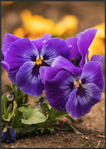

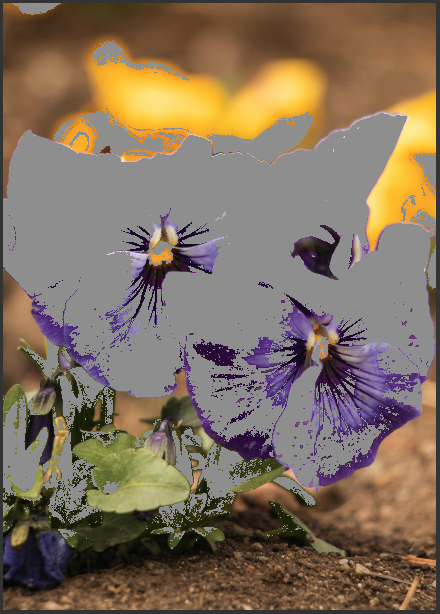
(Left) Gamut warning off, (Right) Gamut warning on
What Is a Gamut Warning?
A gamut warning tells you that certain colors in your image can’t be reproduced accurately by the printer or on a particular material type.
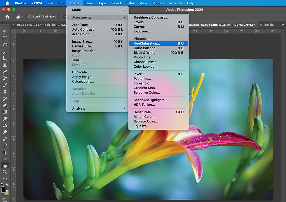
If you’re using a program like Photoshop, you can turn on Soft Proofing and enable the Gamut Warning feature. This will gray out or highlight colors that are out-of-gamut—meaning they’ll be automatically converted to the closest printable color during printing.
Why Does This Matter for Printing?
When an image contains out-of-gamut colors and no adjustment is made, the printer will attempt to translate those tones to the nearest printable equivalent. This can result in:
Muted or dull versions of vibrant colors
Loss of detail in areas with intense color saturation
Prints that don't "pop" like your screen version
This is sometimes noticeable on metal prints, where people expect bold vibrancy and contrast. While metal often enhances the perceived richness of colors, certain highly saturated or screen-only tones—like neons or intense purples—may still fall outside the printable range. Our Acrylic, Canvas and paper prints will allow for more vibrant colors due to the inkjet printing process.
Can You Fix Out-of-Gamut Colors?
Yes. Here are some tips:
Adjust Saturation or Hue: Slight tweaks can bring colors back into gamut without sacrificing vibrancy.
Use Adjustment Layers: Target specific problem areas without altering the whole image.
View Gamut as You Edit: This keeps you aware of how your changes affect print compatibility.

File Preparation for Best Print Results
To ensure your image prints accurately and beautifully, proper file setup is essential. Here's everything you need to know before uploading:
Accepted File Formats
JPG: 8 bits per channel, Baseline Standard encoding
TIFF: 8 bits per channel, no layers, no alpha channels, LZW compression, pixel order: Interleaved
PNG: 8 bits per channel
Color Profile & Bit Depth
Submit 8-bit RGB files only
Preferred color space: Adobe RGB (1998) (Other profiles are accepted but may result in unexpected color shifts)
Retouching & Layers
If you’ve edited your image in Photoshop, flatten all layers before saving your final file
Remove any alpha channels from TIFFs
Avoid layered PSD files
Sample Prints & File Size
For sample prints, export your file at the intended print size
This keeps upload speeds fast and avoids sending unnecessarily large files
Resolution Notes
Our printers automatically optimize image resolution for the chosen print size
Keep in mind: Low-resolution images cannot be enhanced by the printer—submit the highest quality file you have
Artbeat Studios’ Approach
At Artbeat Studios, we print your files as-is unless you select Image Enhancement during upload. That means we don’t adjust saturation, contrast, or color unless image enhancement is selected in Step 4 of the ordering process.
If you’re unsure how your image will translate to print, especially for high-saturation or RGB-heavy images, we recommend:
Checking for gamut warnings before uploading
Ordering smaller test prints first
Contacting our team for advice—we’re always happy to help!
Trust the Process
It's important to remember that even if your print doesn’t look exactly like your backlit monitor, it can still be beautiful, vibrant, and true to your artistic vision—especially when you understand how color works across different media. We hope this info has helped you in your quest of understanding gamut warnings!


Comments